
Timing matters in crypto trading—especially when you're dealing with fast-moving tokens like Pump Fun. Prices can shift within seconds, and understanding when to enter or exit a trade can make the difference between a good profit and a costly mistake.
That’s why learning how to read price charts is one of the most important skills any crypto trader can develop. It doesn’t need to be complicated. In fact, with a few simple tools like chart patterns, trading volume, and support/resistance zones, you can start making more informed decisions with every trade.
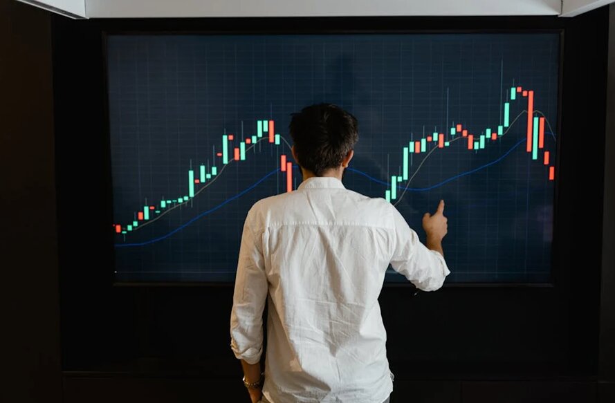
This guide breaks down the basics of analyzing Pump Fun price charts in a simple, step-by-step format to help you trade with confidence.
Step 1: Start with the Chart Basics
Before you start analyzing anything, you need to know what you’re looking at. Most crypto charts display the price of a coin over time using “candlesticks.” Each candlestick represents a certain time period—such as one minute, one hour, or one day—and shows four key values:
- Open – The price at the start of the period
- Close – The price at the end of the period
- High – The highest price reached
- Low – The lowest price reached
By reading the shapes and positions of candlesticks, you can get a sense of whether the price is rising, falling, or staying in a range.
This is especially useful when looking at a token like Pump Fun crypto price, which can have strong ups and downs depending on community activity, hype, and trading momentum.
Step 2: Learn to Spot Basic Chart Patterns
Chart patterns can help you spot trends early. These are repeated price formations that traders use to predict what might happen next.
Here are three easy ones to start with:
- Ascending Triangle
This pattern forms when the price hits the same resistance level multiple times but keeps forming higher lows. It’s usually a sign of building pressure that could lead to a breakout upward.
- Head and Shoulders
This looks like three peaks in a row, where the middle one (the head) is higher than the others (the shoulders). It often signals a potential trend reversal from up to down.
- Double Bottom
This forms when the price drops to the same low level twice but bounces both times. It’s seen as a possible sign that a new upward trend might start.
Recognizing these patterns gives you clues on whether it might be a good time to enter or exit a trade.
Step 3: Check Trading Volume
Volume tells you how much of the coin is being bought or sold. It’s a key factor in confirming any price movement.
For example:
- Rising price + rising volume = Strong move, likely to continue
- Rising price + falling volume = Weak move, could reverse soon
- Falling price + high volume = Panic selling or strong exit pressure
- Flat price + low volume = Market is waiting, likely to break out soon
Volume helps you avoid false signals. If the price looks like it’s breaking out, but volume is low, it might be a fake move that doesn’t last. But if volume rises with price, it adds confidence to your decision.
Always look at volume bars under the price chart. They are usually color-coded to show buying (green) and selling (red).
Step 4: Identify Support and Resistance Levels
Support and resistance are zones on the chart where the price tends to bounce or get stuck.
- Support is a price level where buyers usually step in, stopping the coin from falling further.
- Resistance is where sellers often take profit, making it harder for the coin to go higher.
You can spot these levels by looking at places where the price touches the same line multiple times in the past. Draw a horizontal line on the chart where this happens.
For example, if Pump Fun price keeps dropping to $0.002 and bouncing back, that $0.002 zone is acting as support. If it rises to $0.005 and keeps falling from there, that’s resistance.
These levels help you decide where to buy (near support) and where to sell (near resistance). They also help you set stop-loss and take-profit levels more effectively.
Step 5: Use Timeframes to Your Advantage
Crypto moves quickly, but zooming out can give you a clearer picture. Use multiple timeframes when analyzing charts:
- Short-term (1-min to 15-min): Good for quick entries and exits
- Mid-term (1-hr to 4-hr): Better for day trading or swing setups
- Long-term (daily or weekly): Shows the overall trend and bigger opportunities
Even if you’re trading in the short term, always look at the longer-term chart to avoid trading against the bigger trend.
Step 6: Create a Trading Plan
Once you've done your chart analysis, it’s time to apply it with a plan:
- Set a buy zone near a strong support level or during a bullish pattern
- Choose a target price based on the next resistance level
- Set a stop-loss just below support in case the trade goes the wrong way
Stick to your plan. Don’t change it based on sudden emotion or hype. Following your analysis is key to long-term success.
Website of Source: https://corporatefinanceinstitute.com/
Source: Story.KISSPR.com
Release ID: 1648708